Some of the best resume tips include tips on the best resume font to use.
The font you use on your resume affects the look of your entire resume.
And since the average recruiter only spends 6 seconds reviewing a resume, it’s never been more important to choose your resume font strategically.
You’ll need to use a font that is ATS friendly and easy to read.
Not only is the font type important, but the size and color of the font are equally important.
In this article, we will share the best resume fonts, the worst resume fonts, the best font sizes, and the best font colors for 2022.
Mike Podesto (Founder & CEO – Find My Profession):
Not every resume font is created equal. When it comes to your resume font… stick to the basics! This is NOT the place to show off your “creativity”.
What Are the Best Fonts for Your Resume?
According to Quora, there are roughly 300,000 fonts in the world that fall into 60,000 font families.
Narrowing down the 9 best fonts for a resume was not an easy task.
Our team of resume experts collectively has more than 20 years of resume writing experience allowing us to present to you the tried and proven resume fonts for 2022.
Here are some of the best fonts for your resume:
- Calibri
- Cambria
- Garamond
- Helvetica
- Georgia
- Tahoma
- Verdana
- Trebuchet MS
- Book Antiqua
Why aren’t Times New Roman and Arial on this list?
It’s a common misconception that Times New Roman and Arial are great resume fonts. While they are some of the most popular fonts in general, they are not the best for your resume.
Times New Roman is a compact font and can be difficult to read. Arial is overused and won’t capture anyone’s attention!
What about serif vs. sans serif?
There are four major types of fonts: serif, sans serif, script, and decorative.
For purposes of a resume, both serif (small lines off the sides of letters) and sans serif (no lines) can be used. These fonts are the most professional and easiest to read.
Sans serif fonts are considered modern and simple. Serif fonts are elegant and professional.
Examples of the Best Resume Fonts
We have taken all 9 of the best resume fonts mentioned above and provided samples of what these fonts look like on a resume.
Each sample follows a precise uniformity which allows you to see the font in its standard form, bold, and bold + italic. Use the resume font key directly below for reference.
Resume Font Key

1. Calibri

2. Cambria

3. Garamond

4. Helvetica

5. Georgia

6. Tahoma

7. Verdana

8. Book Antiqua

9. Trebuchet MS

What Are the Worst Fonts for a Resume?
Maybe you have a font in mind that you like that didn’t make our list of best resume fonts above.
That’s ok. While we believe our top nine fonts above are the best, there are other fonts that will still get the job done. But avoid the fonts below.
Here are some of the worst fonts for a resume:
- Times New Roman (overused, hard to read)
- Courier (typeface, outdated)
- Comic Sans (playful, unprofessional)
- Papyrus (playful, unprofessional)
- Impact (too bold, hard to read)
- Futura (bubbly, unprofessional)
- Lucida Console (hard to read, unprofessional)
- Arial (overused, boring)
Despite the opinions of many bloggers (who are not professional resume writers), common fonts like Times New Roman and Arial are not great when it comes to your resume.
As a general rule of thumb, you want to avoid script and decorative fonts that are italic, bold, cursive, or overly playful (see samples below).
Avoid Italic Font

Avoid Bold Font

Avoid Cursive Font

Avoid Playful Font

What’s the Best Resume Font Size?
Adjusting your resume font size can be crucial to making a neat, compact, and fully optimized resume.
The ideal resume font size is between 10 and 12 pt.
You might notice that some fonts take up more space than other fonts, even if they are the same font size. This is one of the reasons that resume font size is not a one-size-fits-all approach.
If you choose to go with a font like Helvetica, Georgia, Tahoma, Verdana, or Trebuchet MS, you may want to reduce your font size since these fonts are naturally larger.
If you choose to go with a font like Calibri, Cambria, Garamond, or Book Antiqua, you may consider using a larger font size since these fonts are naturally smaller.
In any case, do what you can to play around with font sizing on your resume so that everything fits concisely on either one or two pages.
If your resume does not fill up at least ½ of the second page, your goal should be to fit it all on one page.
Font size does not have to be consistent throughout the entire resume.
It is perfectly acceptable for your resume to use, for example, size 11 font for the main body and size 10 font for less important sections such as your address, email, phone number, etc.
If you are going to use various font sizes, make sure the most important resume sections (work experience, education, etc.) use the larger font size.
The headings on your resume are a great place to use a larger size font as well.
Should You Use Color On Your Resume?
The short answer is….yes!
While you don’t have to use color on your resume, it’s something that we definitely recommend to add interest and highlight sections.
Question:
Should I use color for my entry-level resume?
Answer:
Yes.
Question:
Should I use color for my executive-level resume?
Answer:
Yes.
Question:
Should I use color for my federal/government resume?
Answer:
No. The one exception would be for federal or government jobs. For these types of positions, you can throw just about all the best resume font standards out the window.
Besides fed/gov jobs, regardless of the type of job you are going for, industry, or your seniority, color on a resume is generally preferred.
Of course, there is a difference between a CFO resume and a graphic designer resume. Match the boldness of the color you use with your position and industry.
Consider coordinating the colors of your resume with the company’s preferred color palette.
 Quick Tip:
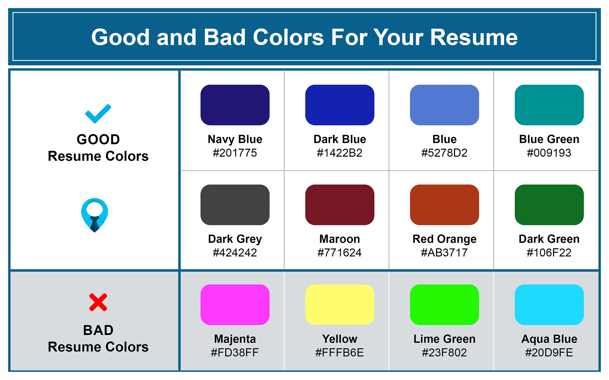
Resume font colors should remain consistent throughout your resume and we recommend never using more than two unique colors (i.e. red and blue).
Below are some good and bad colors to use on your resume:

Where to Add Color to Your Resume
If you are thinking about adding color to your resume, it’s important to have some consistency with the places you are adding color.
The purpose of adding color to your resume is to help key sections stand out.
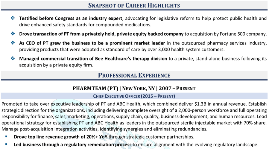
Job titles, company names, headers, and subheaders are the most common places that people add color to their resume.
You might also consider adding color to the bullet points on your resume to match the overall theme (see sample below).

Take a look at Find My Profession’s resume samples for more ideas on adding color to your resume.
What About the Cover Letter Font?
Your cover letter design should match your resume design.
It’s best for your cover letter to use the same color schemes, font sizes, and font types as your resume.
This creates a uniformity that hiring managers appreciate and also makes it easier to know that your resume and cover letter belong together.
Use any of the recommended font sizes, colors, and types mentioned above and your cover letter will be a cut above the rest.
Key Takeaways
When it comes to resume font, size, and color, there is no one size fits all. You can use a variety of resume fonts and still have an amazing resume.
Here’s what you should remember:
- Acceptable resume fonts include Calibri, Cambria, Garamond, Helvetica, Georgia, Tahoma, Verdana, Trebuchet MS, and Book Antiqua.
- Bad resume fonts include Times New Roman, Courier, Comic Sans, Papyrus, Impact, Futura, Lucida Console, and Arial.
- The ideal resume font size is between 10 and 12 pt.
- Add professional colors to your resume to help key sections stand out.
If you don’t want to worry about any of this, you can use a professional resume writer. They know the ins and outs of resume formatting and can take care of it for you! Check out Find My Profession’s resume writing services for more information.


